
Product Manager
Jim Toepel
Designer
Jeff Chang
Engineer
John Kanikula Peters
Josh Beeler
Mindshow
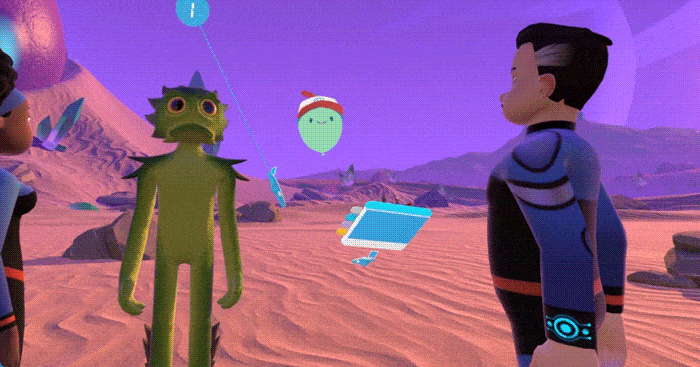
Mindshow is a VR app that lets users create and act in their own animated shows.
My role as the principle UI designer is to create the interface and tools to help guide users in this fun movie-making experience!
Challenges
Mindshow lets players customize their show through a palette of characters, props and worlds. It was important that the interface was not only clear, but helped guide users through this flow. The goal was to get as many people through the funnel by sharing and exporting their shows.
My main charge was to distill that complexity into a simple mental model for players.

In the beginning, we found that users were dropping off because they were confused or overwhelmed. To counter that, I redesigned the interface and flow in the following examples.
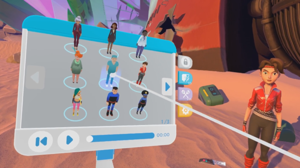
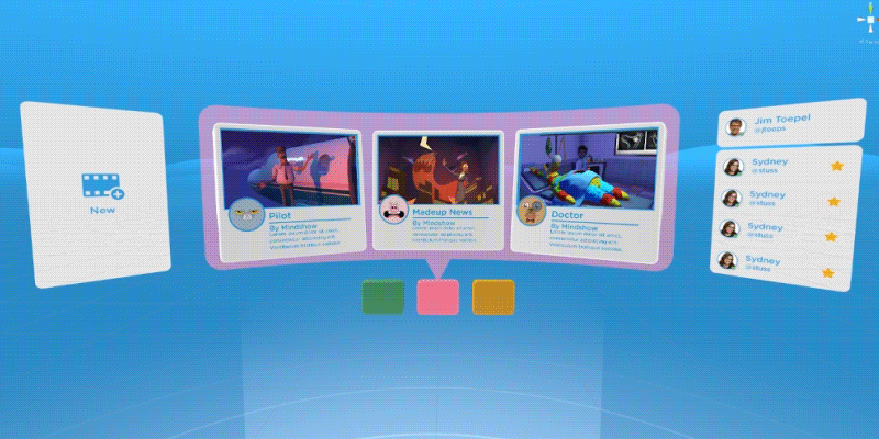
The Handmenu
The Handmenu is essentially a palette that contains characters and props, as well as settings and playback controls.
One of the pain points of the original version was that users wouldn’t know what tab they were on. The playback feature was also hidden and not immediately discoverable.
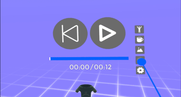
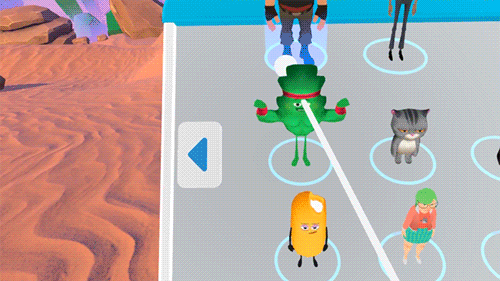
Previous Handmenu design
In this animated mockup, I redid the information architecture to show clear hover and active states. Since we relied on a ‘point and click’ interaction, the tabs were enlarged so they could have easier hitboxes. This helped tremendously in reducing wrist strain.
The playback timeline was also moved to the front as it was an important and frequent interaction to preview a show-in-progress.

For the menu, I created a UI pattern library. These visual indicators help guide users through specific interaction types. In VR, the use of z-space or depth helps communicate what elements are interactable or not.
Along with designing the 3D form of the menu, I also created visual indicators for selection.
In this example, the tooltips also function as a progress bar. This lets the users know they have to hold down the trigger in order to drag a character or prop out.
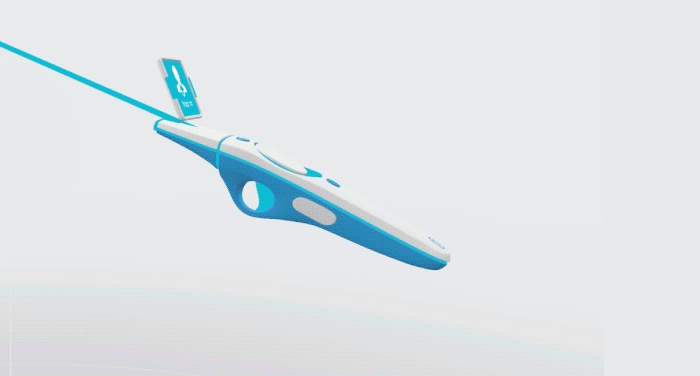
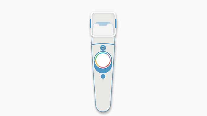
Multi-Tool Controller
The controller is like a swiss-army knife that lets players select characters, set-dress, and edit almost anything in your show. With so many options at your disposal, it was crucial that each of the tools in the controller were clear and discoverable.
Initial user testing showed that players had a hard time finding the tool they wanted. In earlier designs, there was almost nothing to differentiate between tools.
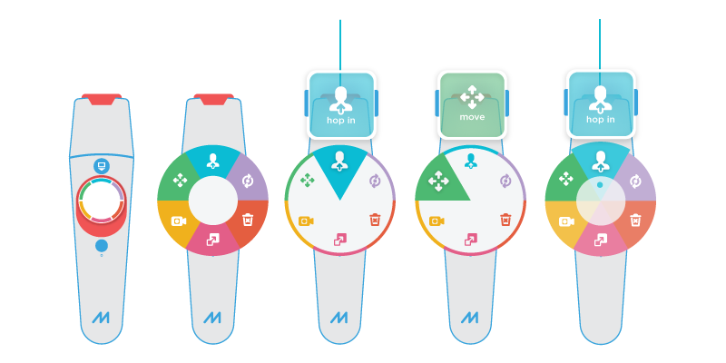
In order to decrease that mental load, my solution was to start color-coding each tool. The peripherals on the controller would change its color state as well.
Once the designs were approved, I created the 3D assets for the custom controller and worked with an engineer to hook up the functionality.
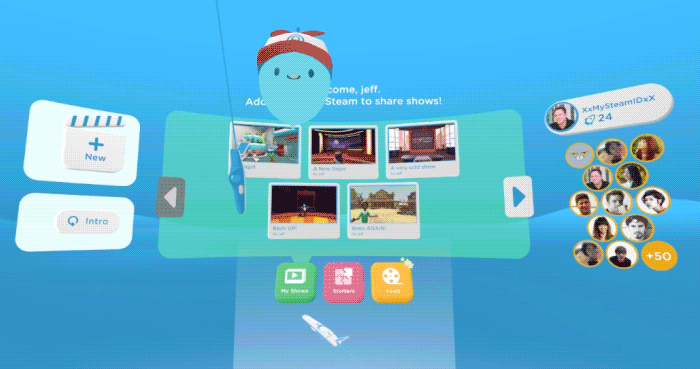
The Homespace
The homespace acts as a community hub that users return to. There, they can be alerted to notifications, see their friends list, and enter into other people’s shows.
While a portion of our user base are creators, there are those who may just want to have a more passive viewing experience. The homespace provides a ‘feed’ of community shows for people to watch, and even participate in!
This is a very early prototype demonstrating how the homespace could look. I created the 3D assets and hooked them up in Unity with animation triggers.
In this concept, it was important to make sure the information conveyed felt right spatially. All the elements were displayed along a curved surface so that it was readable at any angle. The typography had to be large and bold since the resolution of VR headsets at the time weren’t crisp. Even special consideration had to be paid to the size of the buttons and that they could be clicked from a distance.
Feedback
The enhancements to the menu and tool controller has resulted in less of a cognitive load during user testing. We were able to see more users create shows faster without pausing to understand where they were.
One person has noted that the 3D ‘physicality’ of the menu and controllers encouraged a fun, playful aspect. She said it made VR less of a daunting tech and more of a joy to be in.