
Mindshow is an app that lets you create, share, and experience shows in VR.
My role as the principle UI designer is to create intuitive tools and interface to help guide users in this fun movie-making experience!
Mindshow lets players customize their show through a palette of characters, props and worlds. One of the biggest strengths of Mindshow is the user doesn’t have to be a veteran filmmaker or animator. We make it easy so with just a few tools and fun play acting, anyone can make a fairly decent, Pixar-like movie.
My main charge was to distill that complexity into a simple mental model for players. I worked along with the design team to build the visual language and interactions that reflected the brand’s personality and charm.
It was important that the interface was not only clear, but helped guide users through this flow. The goal was to get as many people through the funnel by sharing and exporting their shows. In the beginning, we found that users were dropping off because they were confused or overwhelmed. To counter that, I redesigned the interface and flow in the following examples.
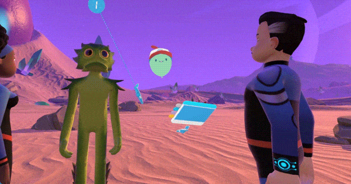
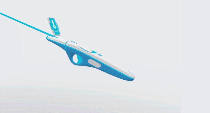
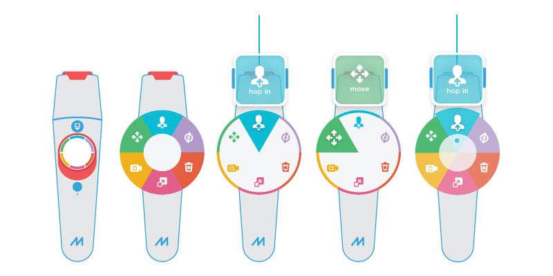
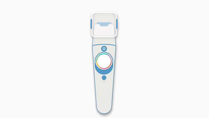
The controller is like a swiss-army knife that lets players select characters, set-dress, and edit almost anything in your show. With so many options at your disposal, it was crucial that each of the tools in the controller were clear and discoverable.
Initial user testing showed that players had a hard time finding the tool they wanted. In earlier designs, there was almost nothing to differentiate between tools. In order to decrease that mental load, my solution was to start color-coding each tool. The peripherals on the controller would change its color state as well.
Haptic feedback and tooltips were important for first time users. The combination helped guided players through the controller onboarding. That change in clarity saw an increase in users recalling what each tool does.
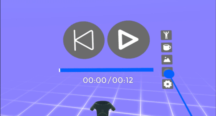
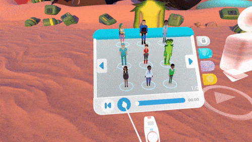
The Handmenu is essentially a palette that contains characters and props, as well as settings and playback controls.
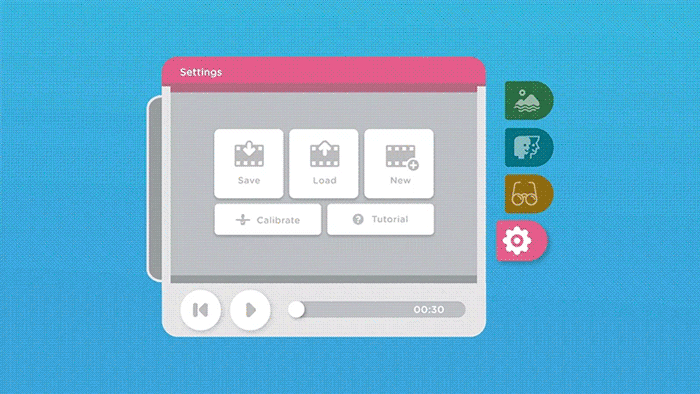
One of the pain points of this version was that users wouldn’t know what tab they were on. The playback feature was also hidden and not immediately discoverable.
It was important in this redesign to provide clarity. In this animated mockup, I redid the information architecture to show clear hover and active states. The tabs were enlarged so they could have easier hitboxes, and reduce strain on motor skills.
I teamed up with the lead engineer to bring that design into the app. The playback timeline was also moved to the front as it was an important and frequent interaction.
In order to prevent users from selecting a character or prop in the middle of playback, I thought it would be fun to collapse the Handmenu. This puts the focus entirely on the viewing experience, and not in edit mode.
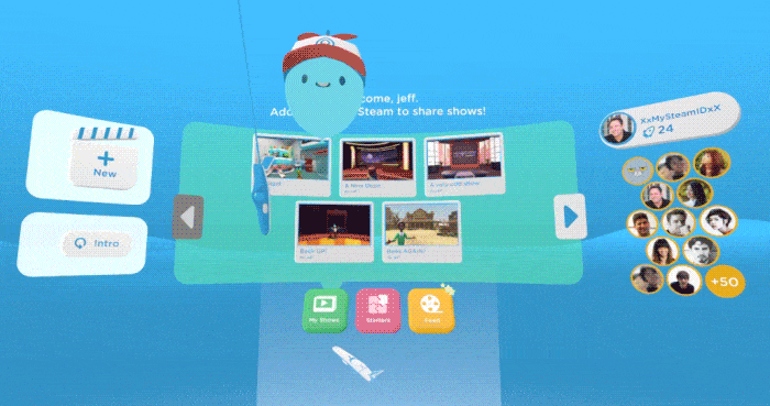
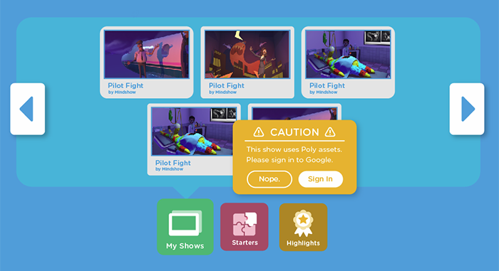
The homespace is a place where players can view a ‘feed’ of shows that they and their friends have made. One of Mindshow’s core loop experience is the ability to make a show and share it with friends to collaborate. My charge was to define the Homespace in a way that encourages those actions.
Rather than bombard the players with all possible options, I arranged and grouped them in a hierarchy that was easier to digest. This involved setting up secondary actions that appear on hover, creating notifications, and accounting for different fail states.
This provided more clarity to the player and reinforced the idea that they belonged in a community. By simplifying the interface, Mindshow became much more approachable not only to new players, but to people who have never tried virtual reality before.